 |
| MODIS image of the Korean peninsula taken on February 15, 2011 |
Introduction
In 1945, United States military officials arbitrarily divided the Korean peninsula at the 38th parallel. Since then, in little more than half of a century, North Korea has developed into the most militarized nation in the world while South Korea has become a democratic and globally influenced nation. The paths of development for the two countries are in stark contrast in terms of global connectedness. While more than 90% of South Koreans own a mobile phone, mobile phones were banned in North Korea in 2004 (since then the ban has been removed, but less than 1 million North Koreans own them). Similarly, South Korea has around 26,000 cybercafes that serve as social meeting places, while North Korea’s first internet café opened in 2002. South Korea is one of the most technologically connected nations in the world; North Korea restricts and censors access to global communications.
Remote sensing will be an effective tool for studying North Korea because we cannot enter the country due to its foreign relations policies as well as restrictive emigration from the United States. Fortunately, remote sensing allows us to study an area without coming into direct contact with it. Historically, this method of observation has been used to look at development in North Korea in respect to patterns in landscape change, deforestation, malaria, flood-risk, and other environmental issues.
We aim to explore the differences created between two geographically close nations (North and South Korea) with varying levels of connection and isolation to the global market. We propose that through examining the the differences between the two countries as well as their change over time through satellite images from 1989 to 2001 we will be able to analyze their contrasting progressions. By doing so, we may be able to draw conclusions about how a nation's level of political and administrative transparency can affect development.
Study Area
Our general study area is the East Asian country of Korea. Located in Northeast Asia on the Korean Peninsula, this 84,610 square mile country is divided into two separate sovereign states. North Korea covers 46,541 square miles of the peninsula with outlets to the Yellow Sea, Korea Bay and Sea of Japan. A majority of this state is incredibly mountainous. Our specific study area, the capital city Pyongyang, is located in west-central North Korea. Throughout the city flows the Taedong River that feeds into the Korea Bay.
South Korea covers 38,691 square miles of the Korean Peninsula. Most of this area is mountainous and non-arable, although many broad coastal plains exist. Seoul, our specific study area, is the state’s capital located in the northwest of South Korea, less than 30 miles from the Demilitarized Zone (DMZ) that separates the two states and is actually the most highly militarized DMZ in the world. The city itself is 605.25 square kilometers. The Han River runs throughout the city bisecting the northern and southern areas.
These two cities are of comparable geography and climate yet entirely different in political ideology. While North Korea is a single party state with a centrally planned industrial economy, South Korea is a free market, democratic and capitalistic country.
Methods
We plan on observing Seoul and Pyongyang with three comparative studies: urban quality of life, night light imagery, and thermal radiation expected from urban heat islands.
I. Urban Quality of Life
Urban landscapes can by analyzed in respect to quality of life. We would like to use remote sensing to look for quality-of-life indicators such as educational institutions and greenness within the city. Other indicators include “adequate income, decent housing, good education, health services, and a good physical environment (e.g., no hazards or refuse)” (Jensen 463). By comparing these indicators in Seoul and Pyongyang we hope to identify problem areas in the respective cities as well as compare their quality of life in respect to their paths of development.
To do this, we will choose comparable downtown and suburban areas in Seoul and Pyongyang and use high-resolution imagery of a small portion of the city to better analyze the portion of land. Ideally, we will use high spatial resolution imagery of 0.25 – 30 meters to identify quality-of-life indicators. (Table 13-1, Jensen 447). Single- family homes may suggest higher quality-of-life than squatter, informal housing, for example (Figure 13-8, pg 458 Jensen). To then qualify this data, we will compare it with in situ observations such as available educational services, Internet access, median family income and average rent.
Urban quality-of-life can also be analyzed in respect to their progress in a developmental cycle. Features can be identified that indicate the stages of development of a city as it moves from undeveloped to developed. In particular, we can observe the stages of residential development, such as partial or complete parcel clearing, land subdivision, infrastructure quality, and partial or complete landscaping (Jensen 444). By applying this development cycle we can better interpret our images.
II. Night Light Imagery
We will be utilizing imagery from 1992 and 2010 with a subset focus on Pyongyang and Seoul. These will be 30 arc second grips, spanning -180 to 180 degrees latitude and -65 to 75 degrees latitude taken from the NOAA Defense Meteorological Space Program Nightlights light time series. We will link the two images and compare any noticeable differences that have occurred in the 18 years in regards to brighter values and the degree of change in each of the nations.
We expect to see stark differences between energy consumption in the two nations. Due to the relative stagnation of electronics in North Korea, we also expect to see a significant increase in South Korean light and energy use as North Korean light and energy use plateaus over the 18 year time period . Additionally we hope to attain data on the amount of power each country has to supplement our visual findings. To help qualify the light brightness data we have found that 90% of South Koreans own a mobile phone with broadband Internet four times faster than that of the U.S. On the other hand, North Korea has only 660,00 cellphone users and only one singular public use intranet service that is regulated by the government.
III. Thermal Radiation
We would also like to use thermal imagery to compare the urban heat island of Seoul to the urban heat island of Pyongyang. Although the population of the Southern Korean capital city (10.4 million in 2010) is about three times as large as that of North Korea (3.3 million), both are distinctly urban cities. All objects above 0 Kelvin give off heat. Urban areas are relatively warmer than non-urban surrounding areas. As Jensen states, “Urban heat islands are caused by deforestation and the replacement of the land surface by non-evaporative and nonporous materials such as asphalt and concrete” (Jensen 286). We expect that Seoul will have higher thermal emissions as a result of its urban features because it has a larger population, but we also believe its higher level of development as an urban city will contribute to the urban heat island effect (such as automobiles, commercial land cover, services, industry, air conditioning systems, and perhaps electronics). Agricultural areas, vegetation, and water will have lower temperatures. To use this thermal data, we will compare daytime images of the two cities from satellites that collect thermal imagery, such as MODIS with a spatial resolution of 1 x 1 kilometer, the Advanced Very High Resolution Radiometer (AVHRR) at 1.1 x 1.1 kilometers or Landsat 7 at 60 x 60 meters. We will utilize data from the Global Land Cover Facility for Landsat 7's Enhanced Thematic Mapper Plus (ETM+) and loaded the thermal band (band 6). This image will display the hottest areas in white and the coolest areas in black. Next, we plan on creating a density slice of this image and assigning a color theory to the image. By doing so, we will be able to compare outgoing radiation from the urban areas of Pyongyang and Seoul.
Ancillary Information
We will supplement our data with other research in order to better understand it and give our research depth. As for quality of life between the capital cities, we will look at indicators such as education index, life expectancy, mean income and health.
South Korea ranked 30th out of 111 included countries in the Quality of Life Index from 2005, but North Korea was not listed because not enough data was collected. We can see differences among the cities in other aspects, however. According to the CIA World Factbook, we can see that 60% of North Korea’s total population lives in urban areas compared to 83% in South Korea. Infant mortality is also much higher in North Korea, at 27.11 deaths for every 1,000 live births compared to 4.16 deaths for every 1,000 live births in South Korea. The life expectancy is 68.89 years in North Korea and 79.05 years in South Korea. Also important is a comparison of health expenditures: 2% of GDP in North Korea and 6.5% of GDP in South Korea. GDP per capita in North Korea is $1,800, contrasting starkly with the $30,000 GDP per capita in South Korea (in terms of Purchasing Power Parity, PPP).
In terms of industry and agriculture, aspects that we will be able to analyze by satellite images, North Korea’s economy is 20.7% agriculture, 47.8% industry and 31.5% services. South Korea is divided into 2.6% agriculture, 39.3% industry, and 58.2% services. In terms of energy production and consumption, North Korea produces 22.52 billion kilowatts/hour and consumes 18.85 billion kWh while South Korea produces a whopping 417.3 billion kWh and consumes 402 kWh. This is in line with our research of Seoul’s high rates of computer usage compared to the restricted usage in Pyongyang.
By comparing these population and economic measures between the two countries, we can better support our image analysis. This information from the World Factbook suggest that quality-of-life, in terms of infant mortality, life expectancy, government health expenditures, and GDP per capita, is higher in South Korea than it is in North Korea. It is also notable to point out that information on North Korea is sometimes not provided on websites such as this one.
Results
I. Urban Quality of Life
1. Comparison of Seoul and Pyongyang through visual images
We begin by comparing the two capitals through visual images. We downloaded satellite imagery from the Maryland Global Land Cover Facility’s Earth Science Data Interface (ESDI). The specific imagery for Seoul and Pyongyang come from Landsat 7’s Enhanced Thematic Mapper Plus (ETM+). We loaded the bands in ENVI in a 3:2:1 and created a spatial subset of the metropolitan regions of the respective cities. From these two images we assume that Pyongyang is a less expansive city with significantly more green space than that of Seoul. Knowingly by making our first assumptions from this data we expect to overlook many aspects that we will further investigate through employing the techniques of ENVI software.
 |
| Visible Image of Pyongyang, North Korea. ETM+ 2001, USGS (Global Land Cover Facility). |
 | ||
| Visible image of Seoul, South Korea. ETM+ 2001, USGS (GLCF). |
2. Comparison of Educational Facilities in Seoul and Pyongyang
We chose to analyze indicators of education in Seoul and Pyongyang to assess quality of life. GoogleEarth provides high resolution imagery in the visual spectrum that is useful for this kind of analysis.
 |
| Dankook University, Seoul. Oct. 2008 (GoogleEarth) |
 |
| Dankook University, Seoul. Apr. 2010 (GoogleEarth) |
We also chose to study the Pyongyang University of Science and Technology, which is a private institution like Dankook University in Seoul, however it is funded entirely by people and foundations outside of North Korea. It is located just outside of the city. In a series of images collected by GoogleEarth from June 2004, November 2006, and October 2010, we can see the construction of the university from its establishment to its opening in 2010. In these six years, the undeveloped land becomes completely developed, but there is much open space between the campus's approximately ten buildings. This contrasts with Dankook University's rapid construction of twenty buildings on its compressed campus in less than two years. It has a much smaller enrollment than Dankook University and does not feature any international exchange programs. Its website is only accessible from U.S. computers through a South Korean web host.
 |
| Pyongyang University of Science and Technology, Jun. 2004 (GoogleEarth) |
 |
| Pyongyang University of Science and Technology, Nov. 2006 (GoogleEarth) |
 |
| Pyongyang University of Science and Technology, Oct. 2010 (GoogleEarth) |
Sogang University is the national university in North Korea. It was founded in 1960 and is located within Seoul. It has 31 buildings and is open to all students of international exchange. It also supplies free wireless for students in classrooms and on campus. Satellite images from DigitalGlobe and GeoEye, accessed on GoogleEarth, show the campus in 2005 and in 2011. The campus undergoes little structural change in these six years; one building is demolished however two more are constructed. It also appears that a parking lot is turned into open space. Tennis courts, an amphitheater, and green space are visible as well.
 |
| Sogang University, Seoul, Oct. 2005 (GoogleEarth) |
 |
| Sogang University, Seoul, Nov. 2011 (GoogleEarth) |
The College of Education, also known as Kim Il-Sung University, was founded in 1946 and is the national university located in downtown Pyongyang. We were unable to access the school’s website and had to translate a Korean webpage to research it. The satellite images of the university from GoogleEarth appears to only have a couple of buildings. One of them includes the “President Kim Il-Sung Revolutionary Ideology Labaratory,” a resource for communist education. Students can study Nuclear Physics as well as Atomic Energy. While Internet and phone calls are free at Seoul’s national private university, students are charged for access at the College of Education in Pyongyang. The University is not open to most international exchange students. The comparison of this university to Seoul's national university demonstrate the contrasting policies of the two countries; South Korea is much more open to national and global connectedness.
 |
| Pyongyang University of Education, Jun. 2000 (GoogleEarth) |
 |
| Pyongyang University of Education, Oct 2010 (GoogleEarth) |
Below we observe the development of what appears to be a port area in Pyongyang. The images show that it takes 10 years to develop the slightest resemblance on an economic port. Such evidence shows that although development is occurring in the North, it is lagging quite far behind the rate of development that we observe in the South.
 |
| 2000 (GoogleEarth) |
 |
| 2003 (GoogleEarth) |
 |
| 2009 (GoogleEarth) |
 |
| 2010 (GoogleEarth) |
3. Comparison of Normalized Difference Vegetation Index (NDVI)
We analyzed both Pyongyang and Seoul through NDVI imagery. NDVI images are created by loading the bands in the 4:3:4 order for ETM+ images. Using images from the same season (September) we observed that although the visual image of the two cities appear to show a greener Pyongyang, after observing our NDVI image we find the opposite. These ENVI software images, which associate deeper magenta colors with livelier green space, show that Seoul is in fact greener than Pyongyang. While within the heart of urban Pyongyang there seem to be plots of green space, Seoul appears to have a similar proportion of green space to urban concrete. The real difference emerges when we observe the areas surrounding the immediate city. It appears that the surrounding area of Seoul has noticeably more thriving live green space than Pyongyang.
 |
| Pyongyang (ETM+, Sept. 2001, GLCF) |
 |
| Seoul (ETM+, Sept. 2001, GLCF) |
It is informative to compare NDVI images from Seoul in 1989 and in 2001. One can see that the urban area becomes relatively less green over this time and that rich magenta-colored agricultural areas decrease around the city. This observation is reinforced by in situ information that documents the decrease in agriculture in Seoul.
 |
| Seoul (TM, 1989, GLCF) |
 |
| Zoom of agricultural area in Seoul (TM, 1989, GLCF) |
We then used change detection in ENVI to compile NDVI images from 1989 and 2001. This displays the change in greenness. Blue values represent a decrease in greenness and red values represent an increase in greenness. Change detection of NDVI shows a decrease in greenness in the urban part Pyongyang while it shows an increase in greenness in Seoul metropolitan areas. Higher amounts of greenness in a city typically indicate a higher quality-of-life (Jensen).
 |
| Change detection of NDVI in Pyongyang from 1992-2001 (GLCF) |
 |
| Change detection of NDVI in Seoul from 1989-2001 (GLCF) |
 | |
| The Korean Peninsula at Nighttime |
Nightlight imagery can be used to determine population and energy usage. Brighter values (noted in our density slices by a warmer color such as red) indicate more electricity used. We used two nightlife images of the Korean Peninsula to help create a timeline from 1992 to 2010. Using a density slice with the same scale we are able to note the significant difference in population size and electricity usage. We divided the image into seven intervals of values, displaying red as the strongest light brightness and black as the absence of light. The location of the DMZ at the 38th parallel as depicted through nightlife imagery divides the peninsula more significantly than ever, drawing a division to contrast the high values of South Korean light usage in comparison to North Korea.
 |
| Density slice of nightlight imagery of Korean Peninsula, 1992 |
 |
| Density slice of nightlight imagery of Korean Peninsula, 2010. |
Although nightlife imagery is not always used to portray development, it seems appropriate in this situation to note the lack of light power usage to be a byproduct of the level of development of a nation. Therefore we may also hypothesize that the contrast between North Korea and South Korea shows over an 8 year period an incredible level of development in the South, and increasing stagnation in the North. Although both nations contain some portion of the brightest part of the light scale in their capital cities, we observe that the coverage in Seoul spans a significantly larger distance than that of Pyongyang. The time lapse also allows us to observe the variation in growth over time between these two nations. In South Korea we can see the expanse covered by light usage nearly doubles between 1992 and 2010 as the intensity of existing areas of light usage simultaneously increases. By 2010 nearly two thirds of South Korea is categorized in the highest levels of electricity usage, while only a small speck of North Korea falls within this very same category.
As we previously hypothesized, there is a stark difference in energy usage between the two nations. We may be able to associate this with the high usage of internet and cellphones in South Korea compared to the nearly non-existent internet and cellphone culture in North Korea. Many of these developments can be attributed to the globalization and development of an open bordered South Korea. Juxtaposed with this growth is the stagnation of the close bordered North Korea. These indicators would lead us to believe that open borders may play an evidently important role in a country’s ability to grow and develop.
 |
| Rumsfeld commenting on a night light image of the peninsula. |
On December 23, 2002, U.S. Secretary of Defense Donald Rumsfeld displayed an image of nightlights on the Korean peninsula, describing, "South Korea is filled with lights and energy and vitality and a booming economy; North Korea is dark."
III. Thermal Radiation
We enacted a density slice separately to the images of Pyongyang and Seoul respectively. Although the two images hold a different range of values, we used 6 similar intervals for both. Red represents the warmest values while cooler colors such as thistle and blue represent cooler areas.
 |
| Density slice of a thermal image of Pyongyang, Sept 2001 (GLCF). |
Thermal imagery of Pyongyang displays warmer areas in the center of the city with temperatures decreasing outward and numerous anomalies. Studies of the urban heat island structure in Pyongyang reveal that it is variable to more diurnal, seasonal, and yearly climate changes. This means that temporal variation in temperature and climate affects the thermal output of the city. Pyongyang experiences average temperatures of 27.8°C during the day and 16°C at night, an 11.8°C difference. Seoul experiences average temperatures of 27.5°C during the day and 19.5°C at night, only an 8°C difference. This suggests that anthropogenic radiative forces within Pyongyang are less powerful than anthropogenic and industrial-based radiative forces in Seoul, meaning that the urban heat island effect is more significant in Seoul than in Pyongyang.
 |
| Density slice of a thermal image of Seoul, Sept. 2001 (GLCF). |
The thermal image of Seoul does not replicate the typical concentric heat island that industrialized cities such as Chicago have. This is a result of the region’s topography and the location of its industries. We can see that the warmest areas in the urban city extend east and west of the Han River. However this warming trend does not extend north and south of the city because mountains prevent the development of commercial and industrial sectors so less radiative heat will be emitted from these areas. Also, air cools with increases in elevation, so mountains are typically cooler than the lower city.
Discussion
As suspected in many regards we find that North Korea is significantly lagging behind the development of South Korea. Although the two areas are geographically similar, their varying politics has shaped their geography.
The significant difference between the two nations development is the time period over which development occurs. While we observe noticeable change in two years in South Korea, we must use a longer time frame of about ten years in North Korea.
Observing a ten-year time period we see that South Korea has nearly doubled in population and electricity use while North Korea only has minimal changes. This is reinforced by our visual images of universities in the two countries and the port in North Korea. We know that over this same period of time, South Korea has open borders and many connections to varying economies around the world while North Korea remains isolated.
Although we anticipated seeing large differences between the thermal images of Pyongyang and Seoul our imagery shows that the variation between the two is not as significant as we had hoped. Even after manipulating our density slices it can be observed that North Korea looks awfully warm. It almost appears as if Pyongyang is around the same temperature as the highly developed and technologically advanced Seoul. Even after ensuring that we were using the same time of year (September) we still conclude that our findings do not illustrate our point to the degree we hoped. Research reveals that although Pyongyang may be warmer, it could be due to the seasonal temperature and diurnal temperature changes. Since we did not look at the effects of air pressure, wind and topography and many feedback systems we are not truly able to use our thermal images to identify urban heat islands. Therefore these images do not have entirely accurate findings.
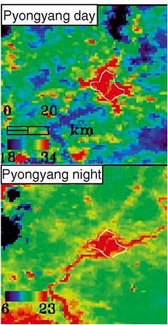

A study on the "Assessment with Satellite Data of the Urban Heat Island Effects in Asian Mega Cities" utilizes diurnal thermal images to provide a better analysis of urban heat islands. We can see that Pyongyang’s thermal imagery is more dependent on solar radiation; the city is warmer during the day and colder at night. This makes Pyongyang’s temperatures more variable between the day and night. The lower temperature variation in Seoul indicates a more powerful urban heat island effect. The city maintains a relatively warm temperatures even after solar radiation is no longer emitted. These images also appear to show warmer bodies of water at night, which makes sense because water retains heat energy better than land surfaces.
Future avenues of research pertaining to urban heat islands include combining various feedback systems such as climate, wind, solar irradiance, and topography to assess the impact of anthropogenic heat on a city’s actual energy emittance. We could also attempt to use thermal signatures of computers to quantify Internet usage in the two cities.
We found that our night light imagery and visual images produced incredibly accurate and telling conclusions. The contrast between the Northern communist dictatorship and the Southern capitalist democracy can instantly be observed, even from space. The imagery accurately portrays the stark difference in economic results the two countries have experienced over the past ten years.
Resulting from our observation of more extensive education institutions, higher energy usage and coverage, and greener urban spaces our overall conclusion is that social and economic connections contribute to a significant difference in development of a nation than geographical location.
References
“About Dankook.” Dankook University. Accessed 29 Nov 2011. < http://www.dankook.ac.kr/web/eng/home>.
“About PUST.” Pyoung University of Science and Technology. 2008. Accessed 29 Nov 2011. < http://pust.kr/>.
“About Sogang.” Sogang University. 2010. Accessed 29 Nov 2011. <http://www.sogang.ac.kr>.
Bureau of East Asian and Pacific Affairs. “Background Note: North Korea.” U.S. Department of State. 31 Oct 2011. Accessed 15 Nov 2011. http://www.state.gov/r/pa/ei/bgn/2792.htm.
“Global Land Cover Facility.” NASA. University of Maryland. 2011. Accessed 30 Oct 2011. <https://lpdaac.usgs.gov/get_data>.
Jacobs, Frank. “218-Korea’s Dark Half.” Big Think. 16 Dec 2007. Accessed 30 Nov 2011. <http://bigthink.com/ideas/21270>.
Jensen, John R. Remote Sensing of the Environment: An Earth Resource Perspective. Prentice Hall, 2000.
Kim, Yeon-Hee, Jong-Jin Baik. “Spatial and Temporal Structure of the Urban Heat Island in Seoul.” American Meteorological Society. Vol. 44, Issue 5. May 2005. Accessed 29 Nov 2011. < http://journals.ametsoc.org/doi/abs/10.1175/JAM2226.1>.
“Korea at Night.” Accessed 30 Nov 2011. <http://www.sciencephoto.com/image/108308/530wm/C0044096-Korea_at_night,_satellite_image-SPL.jpg>.
“Korea, North.” The World Factbook. 2009. Accessed 15 Nov 2011. <https://www.cia.gov/library/publications/the-world-factbook/geos/kn.html#Econ.>.
“Land Processes Distributed Active Archive Center.” USGS. U.S. Department of the Interior. 14 Oct 2011. Accessed 30 Oct 2011. <https://lpdaac.usgs.gov/get_data>.
“Land Remote Sensing Program.” USGS. U.S. Department of the Interior. 29 Sept 2011. Accessed 15 Nov 2011. <http://remotesensing.usgs.gov/feature/description.php?id=186>.
NASA Observatory. “Heavy Snow on the Korean Peninsula.” USGS. 15 Feb 2011. Accessed 15 Nov 2011. <“Korea at Night.” Accessed 30 Nov 2011. <https://lpdaac.usgs.gov/user_community/data_in_action/heavy_snow_on_the_korean_peninsula>.
Pike, John. “North Korea is Dark.” GlobalSecurity. 7 Sept 2011. Accessed 30 Nov 2011. <http://www.globalsecurity.org/military/world/dprk/dprk-dark.htm>.
“South Korea: Economic and Social Developments.” Encyclopaedia Britannica. 18 Feb 2010. Accessed 30 Nov 2011. <http://www.britannica.com/EBchecked/topic/322280/South-Korea/34997/Economic-and-social-developments>.
Tran, Hung, Daisuke Uchihama, Shiro Ochi and Yoshifumi Yasuoka. “Assessment with Satellite Data of the Urban Heat Island Effects in Asian Mega Cities.” International Journal of Applied Earth Observation and Geoinformation. Vol. 8, Issue 1. Jan 2006. Accessed 29 Nov 2011. < http://www.sciencedirect.com/science/article/pii/S0303243405000565>.
WOW! That is a super epic analysis! I think the variables you study are great the comparisons are perfect and I found the time series of places like major Universities extremely insightful! Excellent Job! Sincerely DRG
ReplyDelete